Case Study: Allstate Drivewise App Redesign
Role: UX Researcher, UX Designer, UI Designer
Date: July 2023 - October 2023
Tools: Figma, Microsoft Office, Google Drive
PROJECT OVERVIEW
Owning a car can be very expensive and stressful. Dealing with reckless drivers and the unpredictability of others damaging your car can be overwhelming. With this said, people do what they can to reduce expenses by using car insurance platforms like Drivewise from All State car insurance company.
Drivewise tracks your driving behavior which determines the percentage of discount that you can earn. Users earn 10% of savings when signing up, with the ability to improve to as much as 40% depending on how safely you drive.
CHALLENGE
Drivewise seems like the perfect platform to decrease car insurance payments. Although, according to active users, the overall experience when using Drivewise is very disappointing.
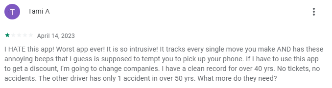
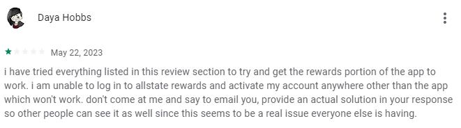
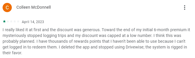
Many users describe the app as “unusable” or “terrible” and these experiences need to change prevent active users from switching into another insurance.
SCOPE
With my personal experience, my proposed solution was to reorganize the information architecture and task flows so that users have an easier time completing a task. In order to determine whether this solution would actually increase engagement on the app, I had to analyze what’s preventing these users from completing tasks.
The scope of this case study is to improve the user engagement and experience for Drivewise users.
DESIGN PROCESS
In this Case Study, I decided to use the Double Diamond approach which was created by the British Design Council in 2005. This method allows the planning process to be iterative and nonlinear meaning you can go back and forward the stages whenever needed.
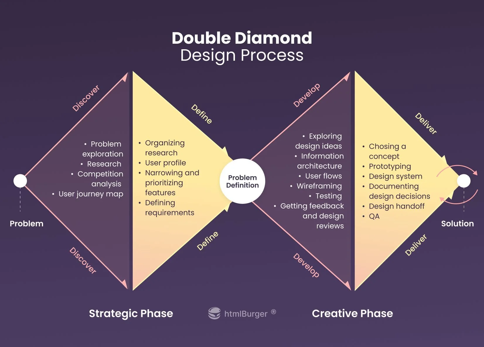
Stage One – Preparation:
Discover: Business Requirements, User Research Findings, Usability Testing, Competitor Analysis, UI Inspection
Define: User Persona, Customer Journey Map, User Flow
Stage Two – Prototyping & Testing:
Develop: Information Architecture, Lo-Fi Wireframe, Design Prototype
Deliver: Full Interactive Prototype, User Testing
STAGE ONE — DISCOVER
The first steps include gathering research and information using resources, surveys, and interviews which will help us understand the initial scope of the project.
BUSINESS REQUIREMENTS
Description: Car Insurance Mobile App that monitors driving behavior using a program called Drivewise.
Objective: Redesign Drivewise UX and UI to improve overall functionality.
Business Goal: Prevent customers from opting out of contract by improving the Drivewise experience.
Business Model: B2C
Target Audience: Anyone who’s eligible to drive, has a vehicle, and has a existing contract with All State Car Insurance.
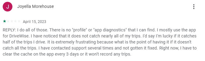
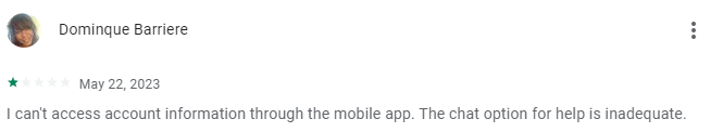
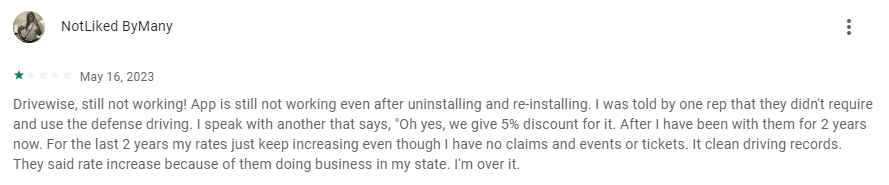
USABILITY TESTING
To better understand the challenges, I interviewed several users who experienced confusion when using the Drivewise application. Based on the results the overall outcome of these interviews include:
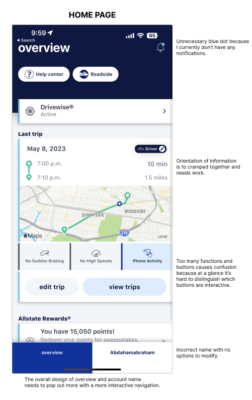
Some users become frustrated with account login.
Some users experience account names being misspelled with no options to modify.
Users gain false trips or inaccurate trips while driving or even away from their vehicles which ultimately impacts their driving score.
Users often deal with phone crashes and uninstalling/installing processes which leads to impatience.
Very little to no app diagnostics leads to many confused users.
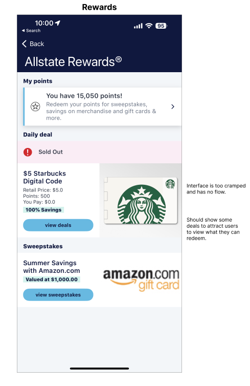
Allstate Rewards UI is very basic and doesn’t get users excited about redeeming points.
USER RESEARCH FINDINGS
Apple App Store Review: 4.8 / 5.0
Android App Store Review: 3.7 / 5.0
Android users encounter more issues with tracking of false trips.
Most recent reviews on the app store consist of 85% negative reviews, which means users are currently not satisfied with the app.
COMPETITOR ANALYSIS
When comparing each auto insurance company, I based the reviews on their telematic driving programs. As a result, you see how competitive the market is for auto insurance. Therefore, there is very little room for error because customers are very likely to change insurance from frustration and impatience.
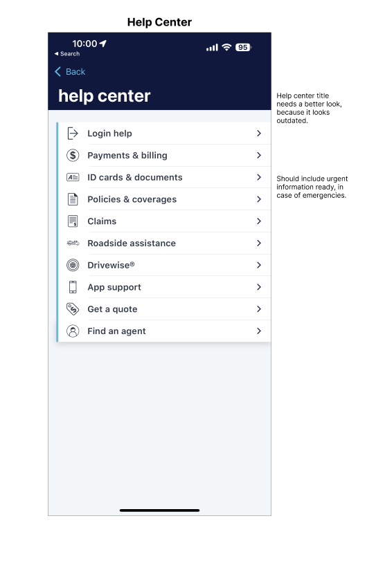
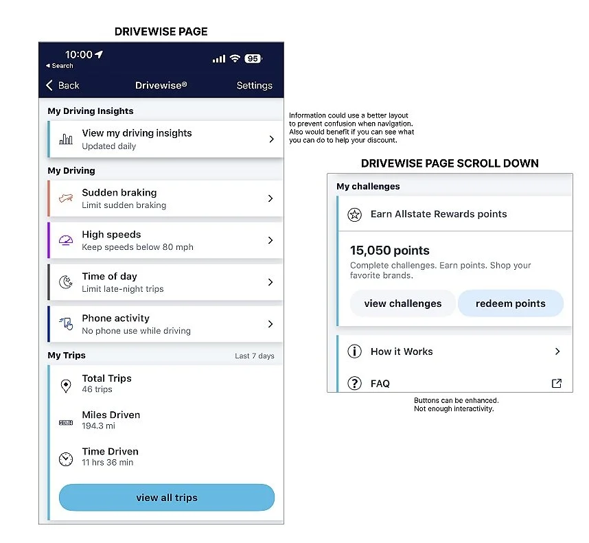
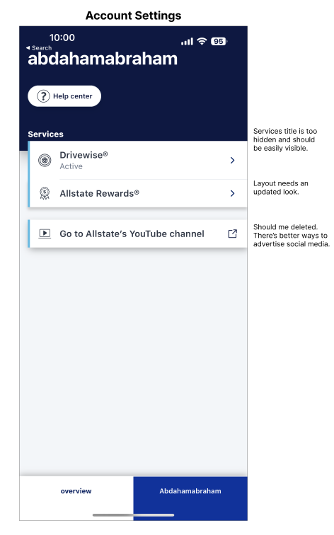
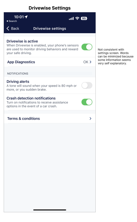
UI INSPECTION
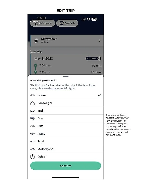
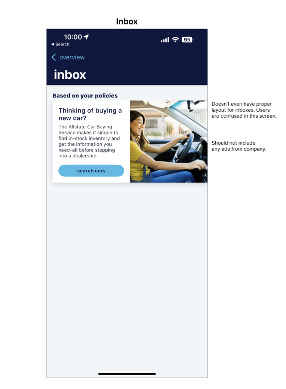
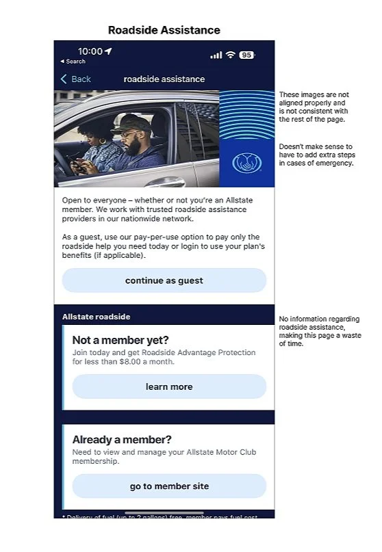
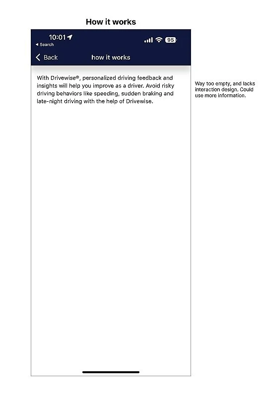
Using Jakob Nielsen’s 10 principles, I analyzed each screen for AllState’s current Drivewise platform. Below shows the screenshots and critiques for each screen that needs improvement. The capitalized titles are the main screens we want to focus on.

STAGE ONE — DEFINE
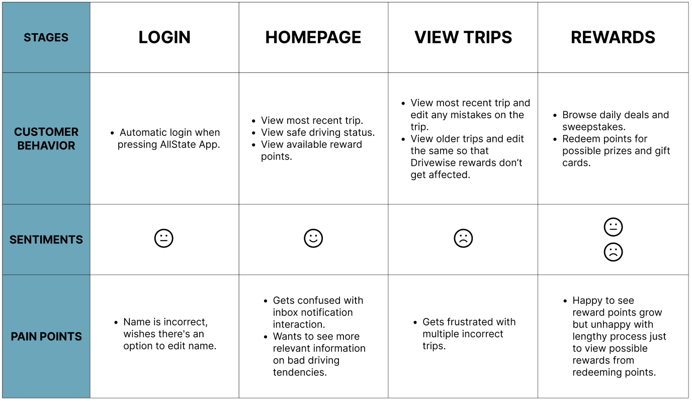
USER PERSONA & CUSTOMER JOURNEY MAP
By creating 2 user personas depicting a persons behaviors, goals, and frustrations. We have Bob who is a frequent user and Sarah who is a new user. It allows us to understand challenges users may face from different occasions. Afterwards we created a journey map depicting each users process when attempting to accomplish a certain goal.
Bob - 50 years old
Resides in NYC
(Frequent User)
About: Bob lives in NYC and he just bought a new car. He saw that AllState Drivewise allows you to save money by monitoring your driving behaviors. With the expensive living costs in NYC, Bob needs to find ways to ultimately reduce monthly payments with his insurance.
Goals: Bob wants to save money using Drivewise so that he can catch up with NYC living costs.
Behaviors:
Bob works a full-time job in Upper East Manhattan and needs to commute from Queens.
Bob needs to pick his kids up from school after work every day.
Bob must look for parking at work and at home, because he doesn’t have a garage.
Bob is not very tech savvy.
Frustrations:
The app often freezes when driving in areas of little to no service.
The app often logs trips even when Bob isn’t using his car.
Bob has a hard time trying to keep track of his driving behavior and his discount percentage.
Bob has a difficult time with account settings whenever the app logs him out.

Sarah - 21 years old
Resides in PA
(New User)
About: Sarah works and studies remotely 40+ hours a week. She barely uses her car, only to get groceries or hit the gym. She must pay for her tuition as well as living costs, and therefore trying to save as much as she can. With the platform Drivewise, she can take advantage of her car usage and save money on car insurance.
Goals: Sarah wants to save as much money on insurance so she can use more of the money for her tuition.
Behaviors:
Uses her car mainly for groceries, gym, or shopping.
She lives in a suburban area and traffic is never an issue.
At days she uses her bike to commute to save money on gas.
She takes great care of her car and is very detail oriented.
Frustrations:
Sometimes log trips when she’s biking or commuting, which shouldn’t happen.
App often crashes when she’s trying to redeem points from the rewards system.
When she drives, the app doesn’t log all her trips which leads to confusion.
Wants to review app diagnostics, but information is rather vague and minimal.

USER FLOW
The old user flow was very clustered and most of the tasks where included in “Overview”. Therefore, I separated related tasks into account which overall makes navigation more efficient. I also eliminated unnecessary steps for certain tasks such as “Roadside Assistance” and “Help”. In conclusion, this is the finalized user flow that I believe will ultimately improve User Experience:
STAGE TWO — DEVELOP
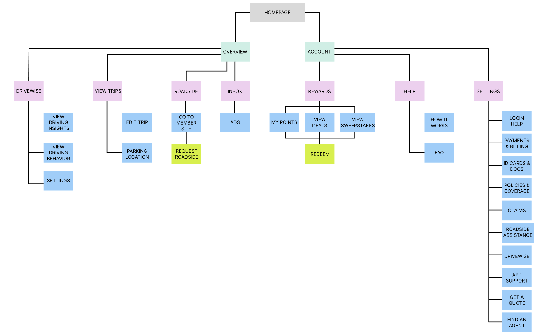
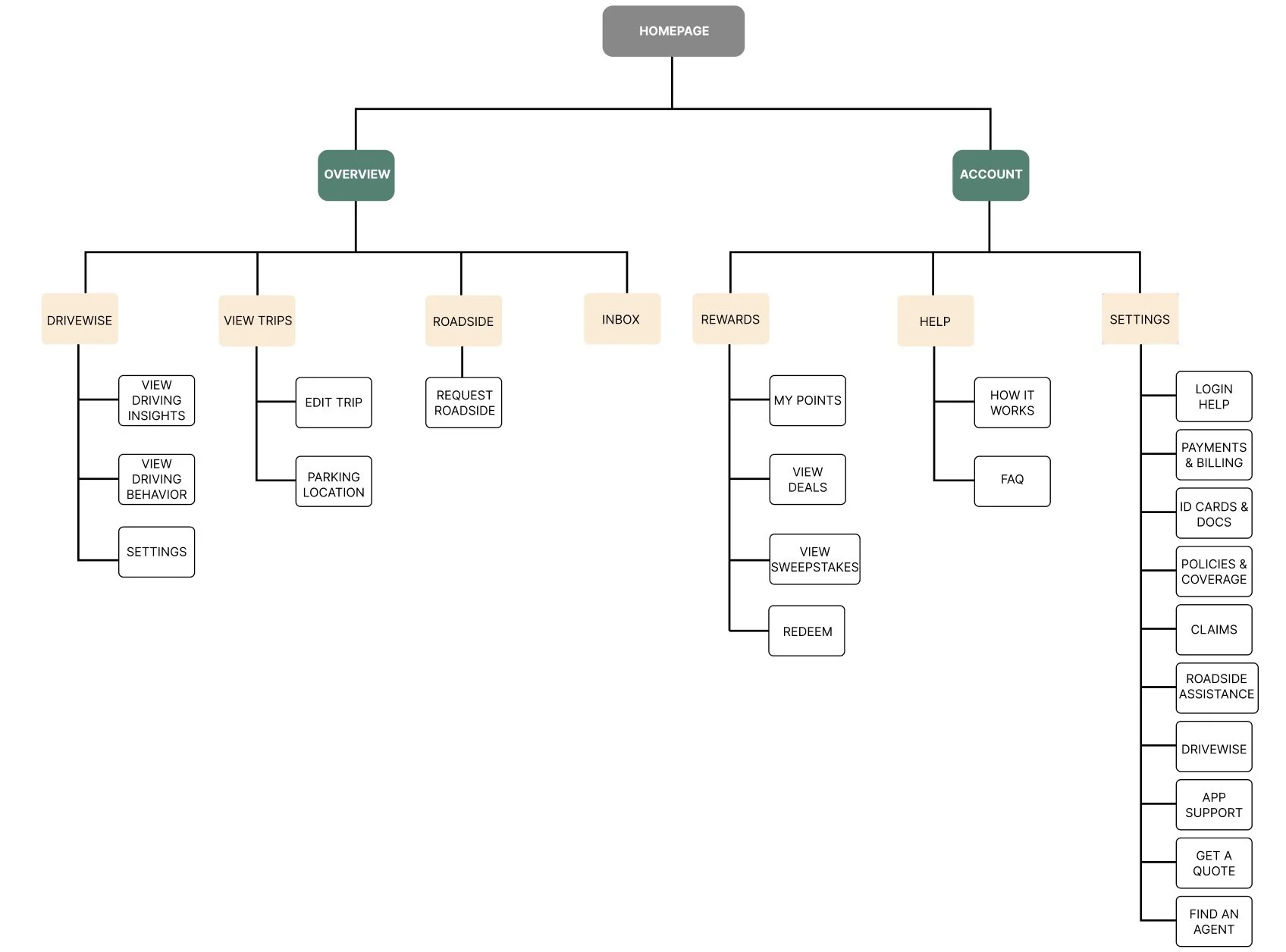
INFORMATION ARCHITECTURE
Similar to the user flow, I implemented two main passages “Overview” and “Account” which improves organization. Below are all possible tasks users can perform when relating to their Driving Behavior and overall Drivewise status.
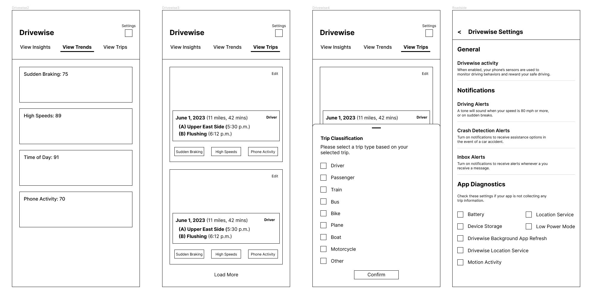
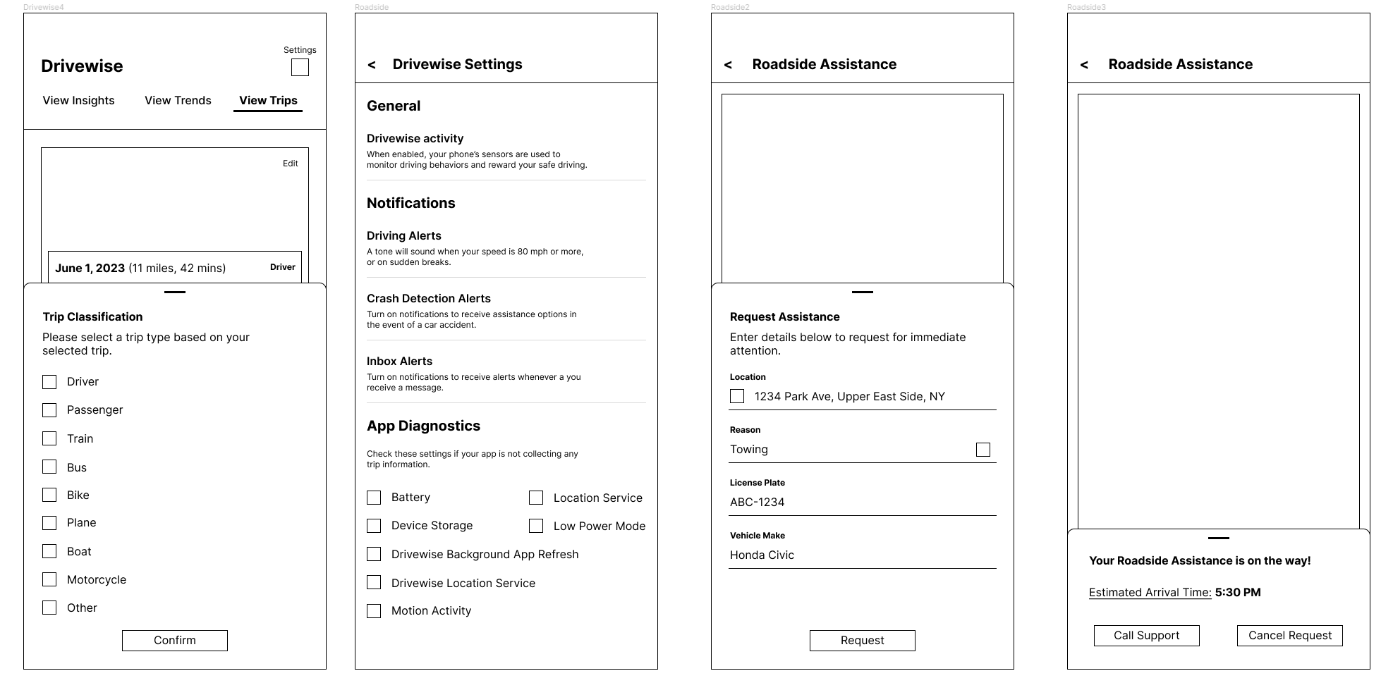
LO-FI WIREFRAMES
Below includes the initial blueprints for each app screen that I redesigned:


STAGE TWO — DELIVER
DESIGN PROTOTYPE
When creating the final prototype, I must recall the main pain points and how each design should ultimately prevent these challenges to burden users when completing a task.
User Testing:
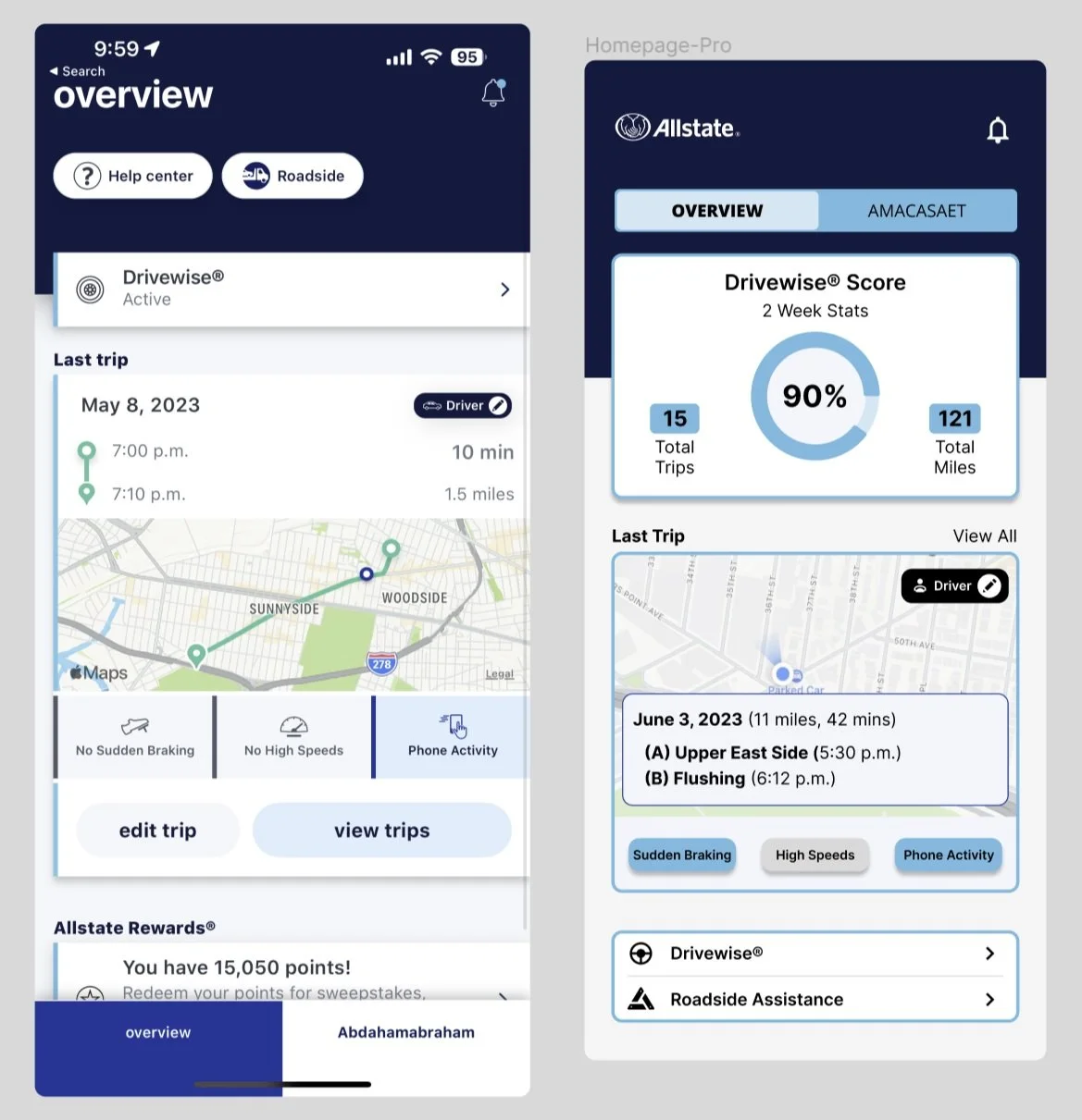
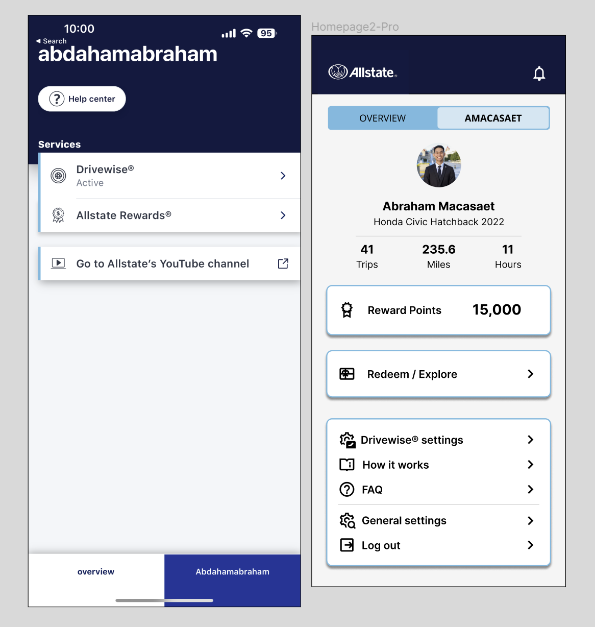
Looking back into the Define stage, my proposed solution to improving app engagement was to reorganize information architecture throughout each task. With this said, I had to research Drivewise users’ main frustrations. These challenges include confusing account management, inaccurate trip logs, outdated UI, and unpredictable system crashes. Using reviews from both Apple and the Google app store, I concluded that the majority of system issues occur at the main homepage because of it being so scattered.
With this said, I rearranged the information architecture so that the account based tasks efficiently categorized. Using A/B testing with the original UX and my redesigned prototype, I concluded that users complete tasks quicker with my prototype. The old UX has too much ads and irrelevant details not pertaining to the task at hand.
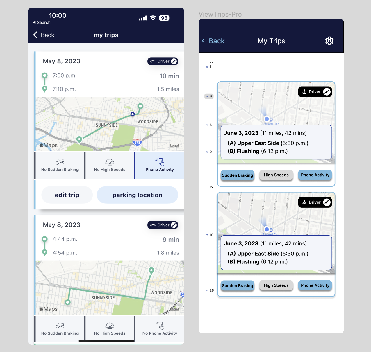
When users view trips, regardless of age, they get frustrated looking for specific trip dates. Instead of scrolling all the way to the bottom, I implemented a timeline based view log so that users can easily find the desired driving day. With A/B testing, users were less satisfied with the new prototype because it took a little bit of time to figure out the timeline of trips. Although, users with the old UX believed scrolling down is easier but more time consuming.
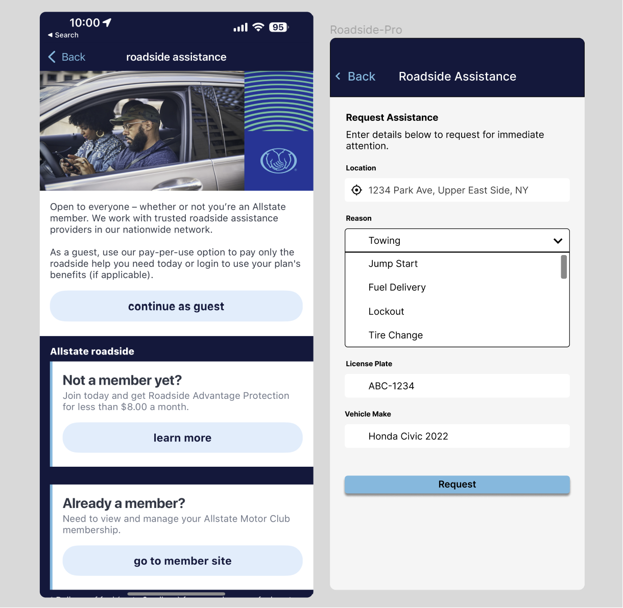
Lastly, one of the most important aspects of car insurance is roadside assistance. The old UX was so bad that more than half the users would rather use the website than the app when trying to request. My results from A/B testing shows that users with the old UX are confused and irritated because of the redundant actions just to perform a simple task. Users with the new prototype were immediately able to perform the task without any hesitation. The action to sign in again before requesting for Roadside Assistance is completely unnecessary.
In conclusion, my final prototype will always need iterations because it is nowhere near perfect. This case study was created because most of these challenges were very similar to those I’ve faced using the app. Therefore, I decided to use my prior knowledge along with data given and collected by users in my community to ultimately give it my own rendition of how certain changes can positively impact engagement in the app. I tried my best incorporating real work scenarios so that I can better understand design processes and strategies.