
Overview:
Amazon is a leading e-commerce platform that offers a wide range of products, from books and music to electronics and home goods. The extensive range of products at competitive prices puts them ahead of all competition.
With this said, no matter how profitable the company can be, there is always room for improvement. As an active user of Amazon Prime, I tend to recognize certain UX/UI challenges that I believe can be modified to ultimately lessen user errors.
Problem Statement:
Streamlining Amazons’ checkout process to reduce cart abandonment and increase conversion rates.
Challenges:
Extremely competitive market
No access to users for qualitative user research
Compliance and Regulatory Requirements
Heuristic Evaluation of existing Checkout User Flow:
Over the years I have noticed software updates improving the UX and UI. With this said, I will implement my personal modifications that I believe will help enhance user satisfaction. To better understand my objectives, let’s look into my analysis for the Heuristic evaluation of Amazons checkout process.
Aesthetics and hierarchy of information needs improvement and reorganizing.
Visibility of system status would help immensely.
Confusing promo/gift card process.
Payment and Shipping processes need to emphasize differentiation.
Decrease the number of abandoned carts to increase conversion rates.
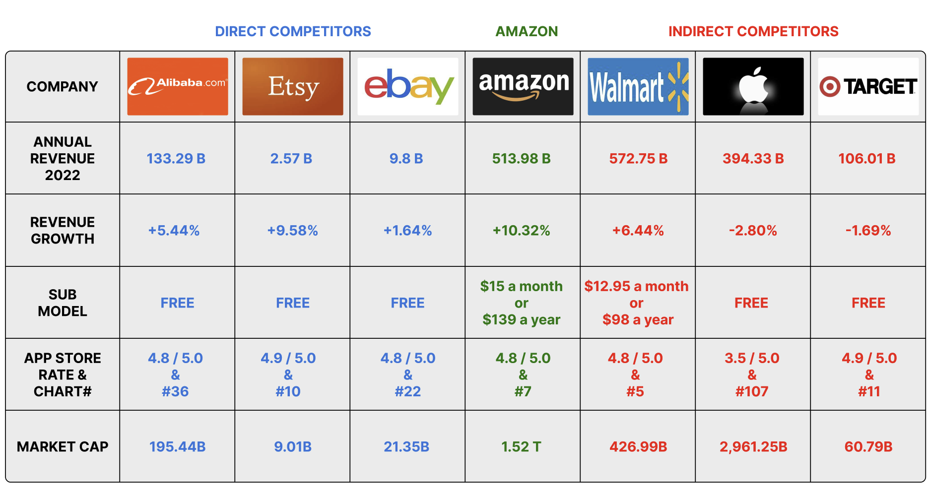
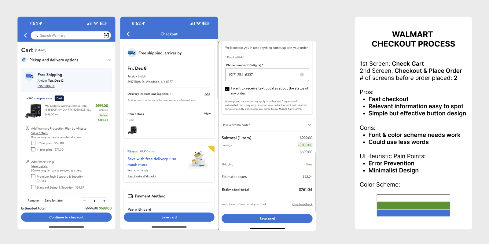
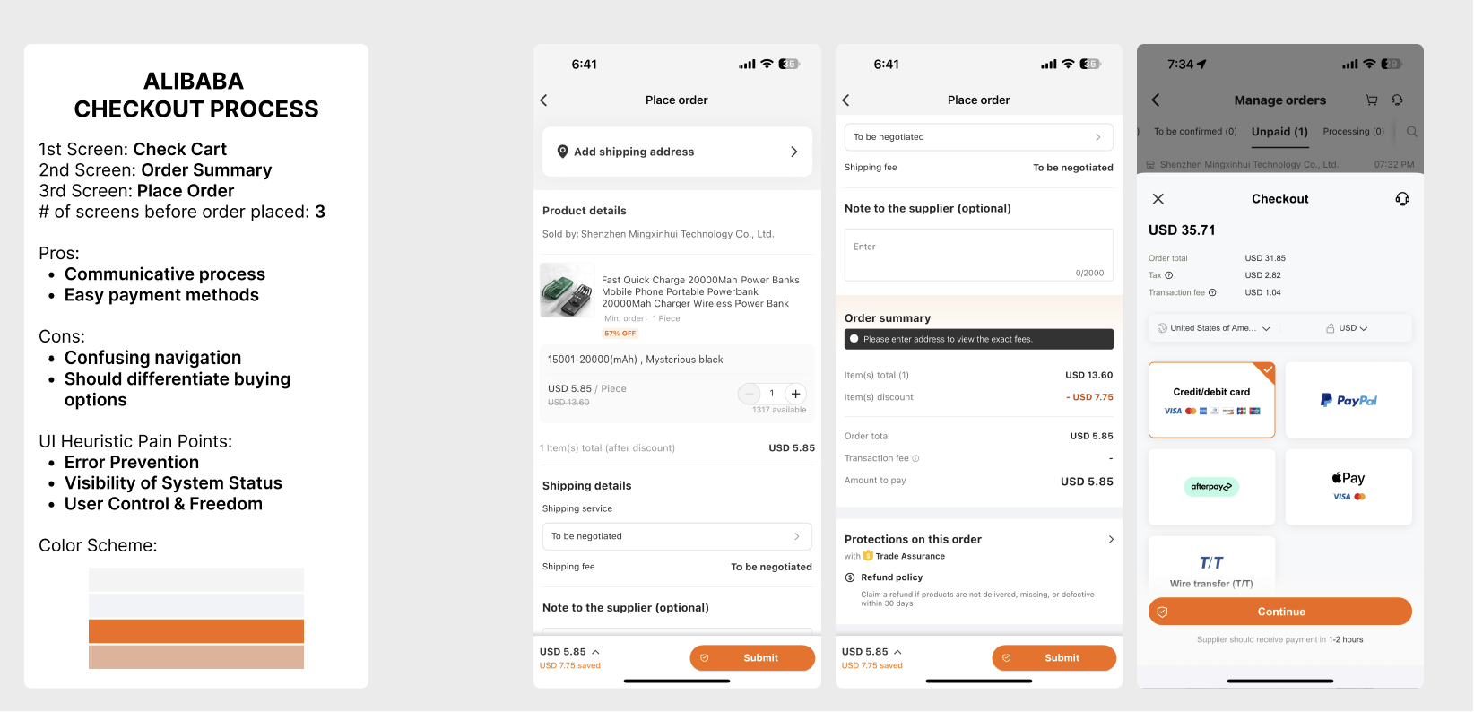
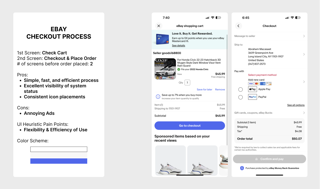
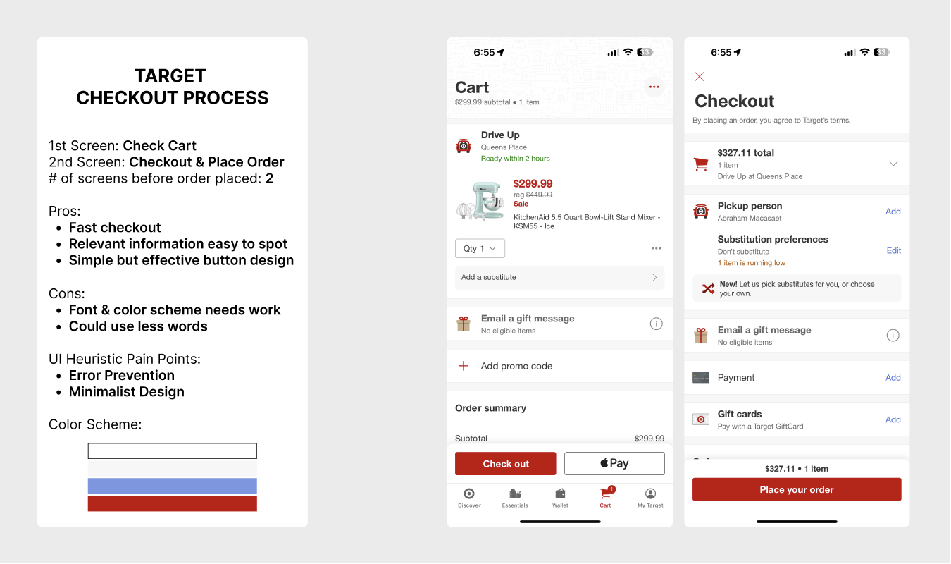
COMPETITOR ANALYSIS
Below are Amazons top 3 direct and top 3 indirect competitors, comparing how they value in the market in regard to Amazon.
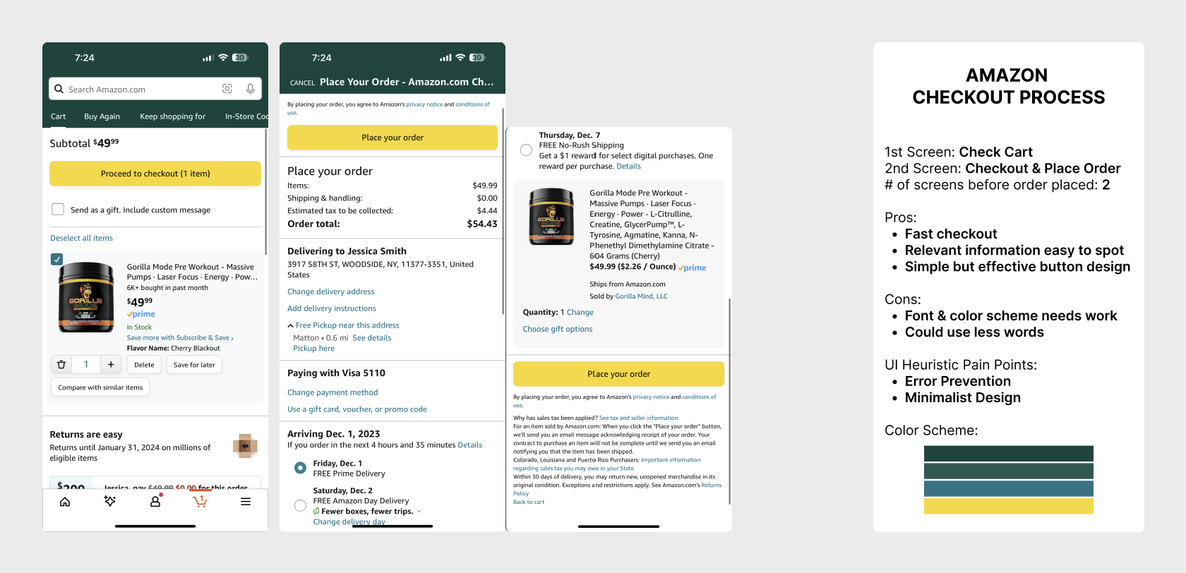
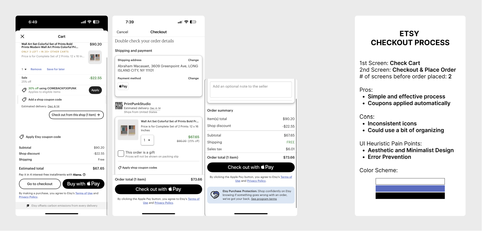
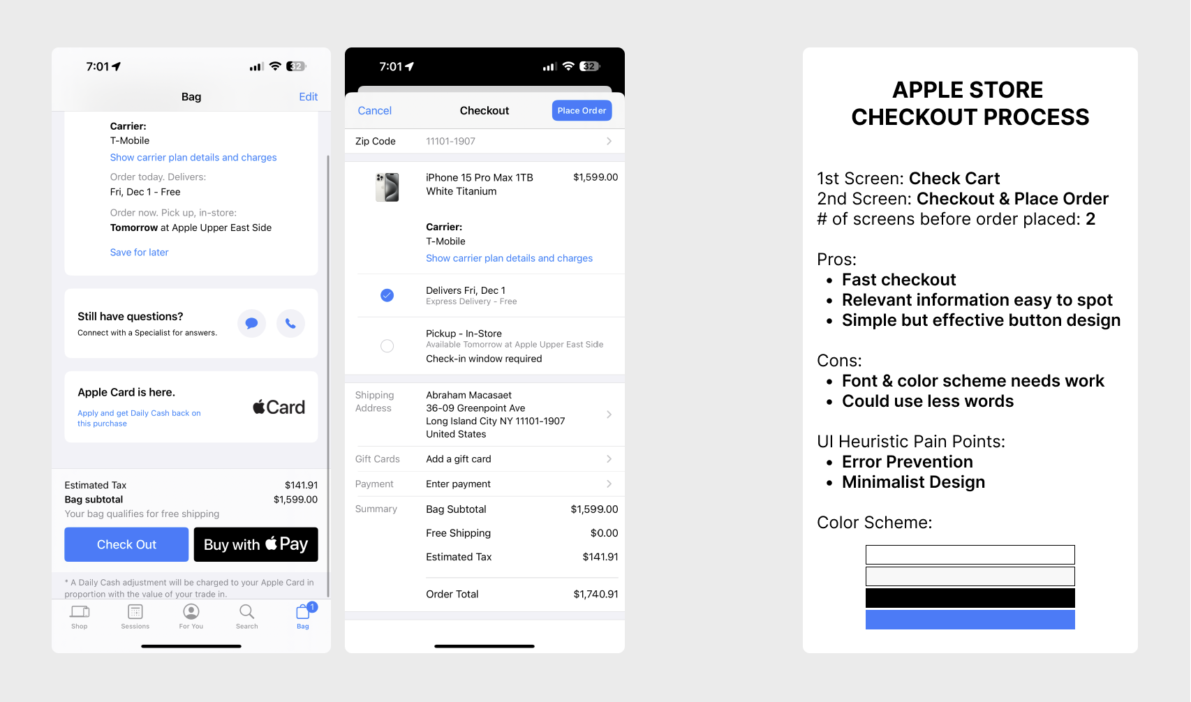
UI HEURISTICS
Each competitor's checkout process designs are displayed to fully distinguish their main similarities and differences.
DESIGN OBJECTIVES
Revise Amazon’s checkout user flow.
Differentiate Payment & Shipping.
Implement visibility of system status.
Modify gift card, promo code, process.
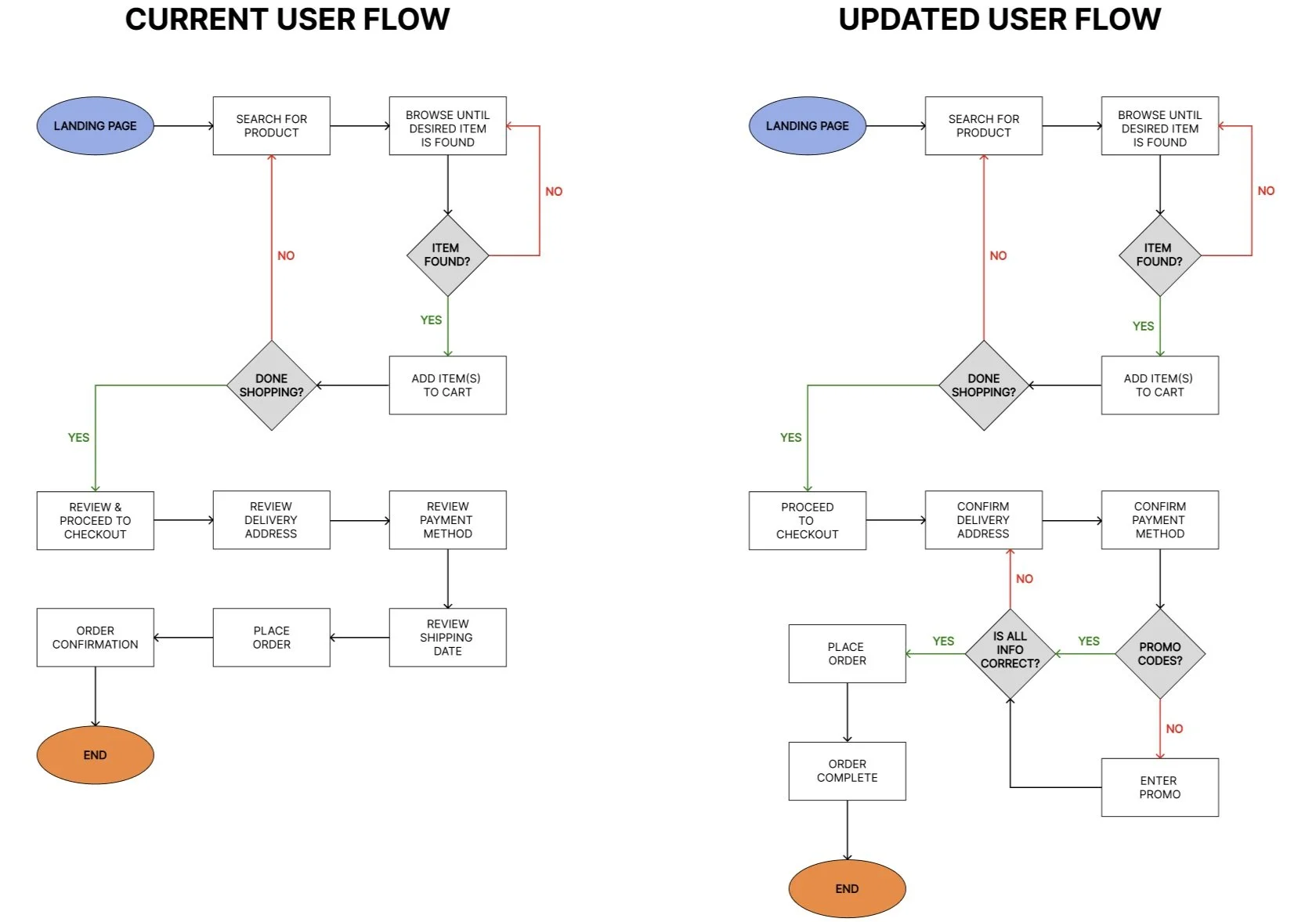
USER FLOW
Right before placing the order, I wanted to implement visibility of system status throughout the process; thus, before placing order, the “place order” button will be locked until all information is confirmed and correct.
This will ultimately improve error prevention and visibility of system status during checkout. I believe these changes will resonate more with the customer because it allows users to be more careful by force.
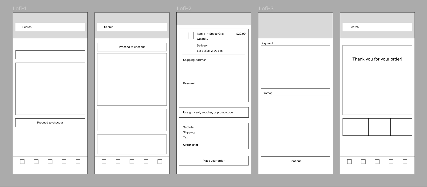
LOW-FIDELITY WIREFRAMES
PROTOTYPING
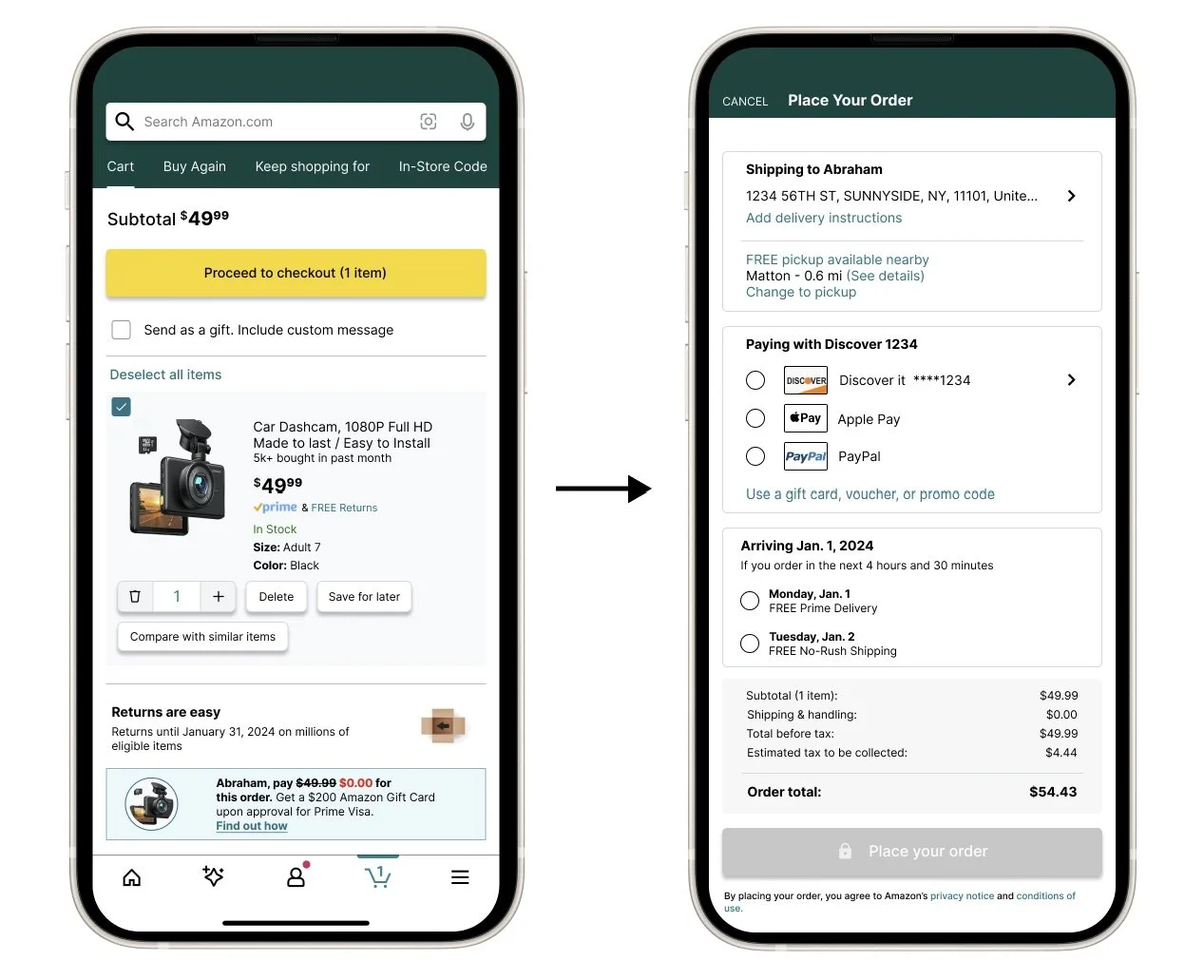
User Flow 1 - Differentiate Payment from Shipping.
Organized Payments & Shipping by enclosing in a box filled with default preferences rather than just a line across.
Before
After
Case Study: Amazon Mobile App Redesign
Role: User Flow, UI/UX Designer
Date: October 2023 - December 2023
Tools: Figma, Microsoft Office, Google Drive
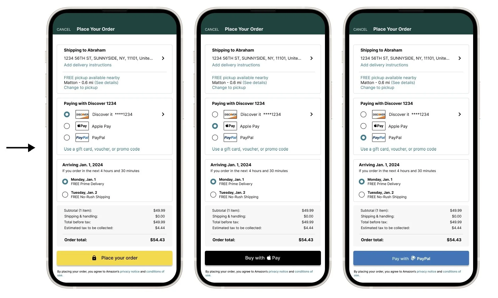
User Flow 2 - Implement visibility of system status.
The “place order” button will be locked until all information is confirmed.

User Flow 3 - Modify gift card, promo code, process.
You can know choose which gift card you want to utilize for the payment, as well as name the gift card depending on the user. Adding on and off switch will also give users a better realization of what method or card is currently chosen.
Before
After
