Case Study: ParkNYC Mobile App Redesign
Role: UX Researcher, UX Designer, UI Designer
Date: September 2022 - January 2023
Tools: Figma, Microsoft Office, Google Drive
Challenge:
The scope of this case study is to create a simpler way of navigating the app by eliminating unnecessary content, adding useful information, and revising the User Interface of main function screens. The main functions I must focus on include account verification, payment methods, and managing active parking sessions. Each of which, will incorporate new tasks and design flows. Ultimately, I want to increase daily user activity and prevent reoccurring issues.
Project Overview:
If you live in NYC, you understand how chaotic traffic and parking can be. When people are in a rush to get to places, paying for parking is the last thing on their minds. With that said, the methods for payment should be efficient and convenient. Unfortunately, the app ParkNYC has failed to provide the simple function of paying for parking on your phone due to its out dated user experience and user interface. With this said, I decided to redesign the entire app fixing key problems that many users encounter on an everyday basis.
Design Process:
In this case study, I will be utilizing the “Design Thinking” method.
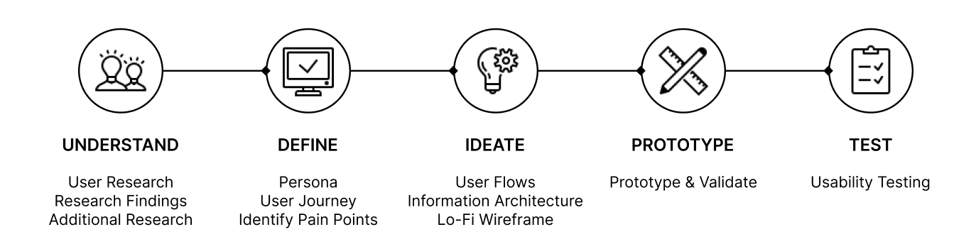
UNDERSTAND
User Research:
ParkNYC has a 1.4 out of 5 rating in the IOS store. With this said, I utilized the app store reviews to get an idea of what previous and existing users think about the app. Some of these reviews include:
“I dislike having to add $25 to the wallet in order to utilize it...”
“No customer service to assist- can't login, can’t get my money’s worth of anything...”
“Sign up button doesn’t work; wallet concept is a scam that the multiplier is different than parking cost which forces you to bank with this app...”
“App is super outdated and needs to be fixed...”
“The app keeps giving me issues and error messages every time I put the zone number from any parking streets...”
Research Findings:
It was very informative reading what users had to say, and most, if not all, comments were negative. Users are having a lot of issues with the app, ultimately leading to uninstalling. In addition, I decided to interview about 10 people about their experience with the app and my conclusion from these interviews are:
6 out of 10 users encounter app freezing or crashing.
6 out of 10 users have difficulties with account creation or profile edits.
7 out of 10 users have issues just navigating the app and finishing a task.
10 out 10 users want more payment methods and dislike current way of payment.
Additional Research:
According to the mobile app analytics platform (astools.io) reviews have increased constantly in the past 6 months.
Users are getting frustrated with the app, leading to very negative reviews and uninstalls.
Version history has not been updated in 2 years, which shows the absence of technical support.
DEFINE
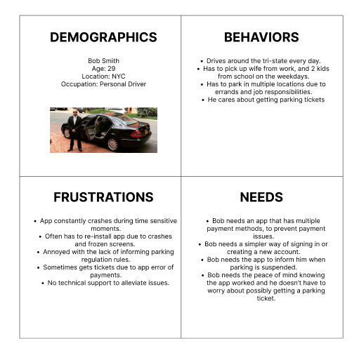
Persona:
Using the reviews from the app store and additional research findings I created a User Persona. This is all based off users who most likely would use the app multiple times a day in different locations. The User Persona describes the users' active behaviors, frustrations, and needs from the ParkNYC app.
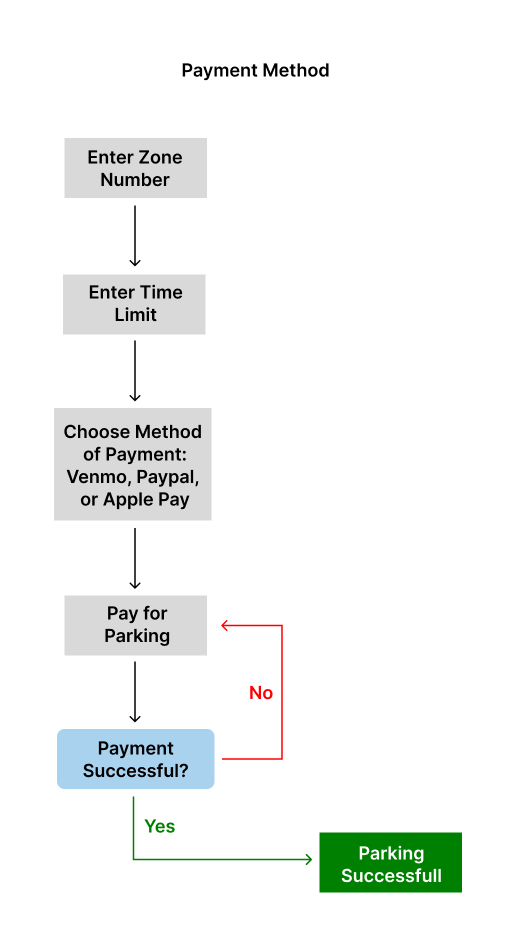
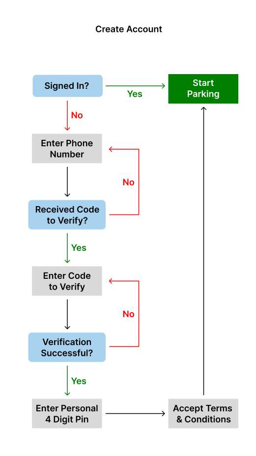
User Journey:
There are mainly 3 stages that I wanted to focus on: Account Settings, Payment Method, and Parking Session. With this said, using the research findings I created a user journey depicting users experience and desirable improvements. This will allow me to better understand how to approach the next steps.

Identify Pain Points:
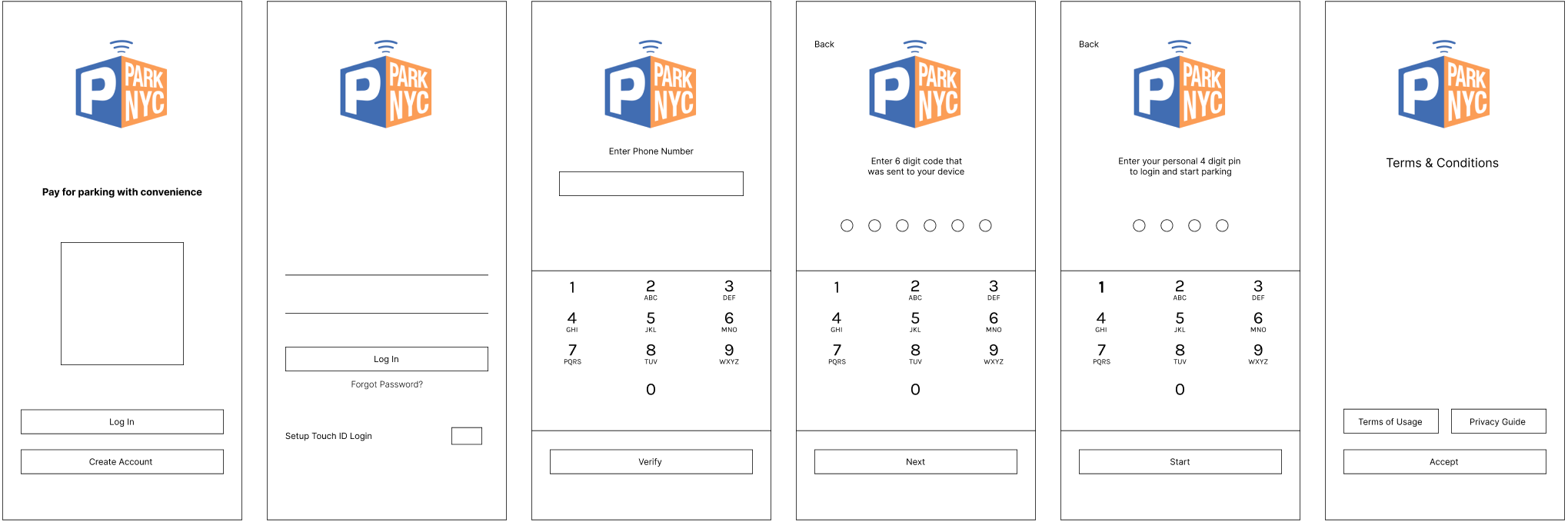
Pain Point 1: Difficulties signing in or creating account
Problem: Users encounter app freezes and crashes when attempting to log in after a first attempt. The only way to fix this is by uninstalling and installing the app. On the other hand, the method of creating an account is very inefficient. Users often have issues with email address verification, which ultimately leads to impatient users.
Potential Solution: The best way to improve the account settings tasks is by changing the verification method. Instead of asking for a phone number, email address, and password, I will incorporate only a phone number verification. Users will input their number and a pin will be sent to their phone which they will have to input into the app to complete verification. Once they verify, they can start parking sessions and overall will save time and prevent issues when creating an account. The user will remain online unless they personally log off. Once they log off, they must verify their phone number again to enable them to access the app.
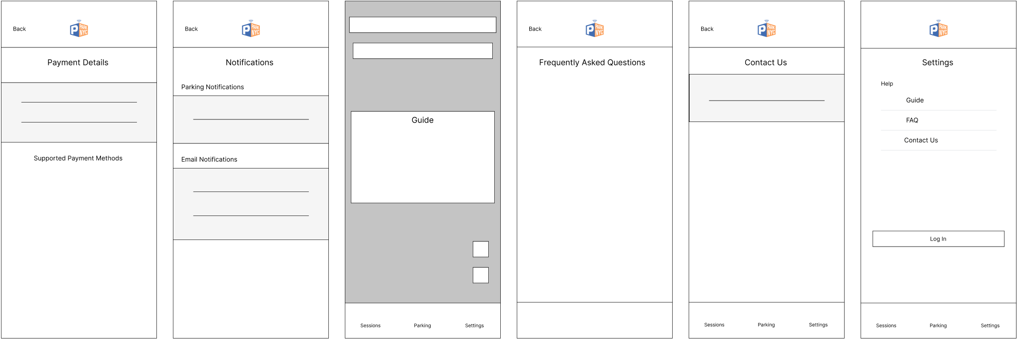
Pain Point 2: Payment method lacks security and is inefficient
Problem: Users dislike that there is only one way to pay for parking. The method of payment involves adding funds from your bank. With this said, users are not happy using more money than the actual parking session.
Potential Solution: One way to directly tackle this issue is by eliminating the current form of payment. The users need a very fast and convenient method of payment, at the same time preventing any excess fees. Therefore, I am implementing 3 main methods of payment: Apple Pay, Venmo, and PayPal.
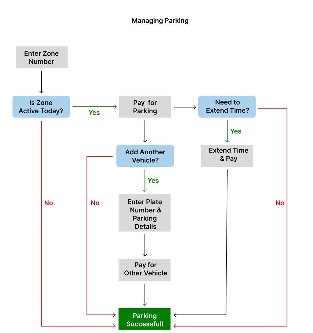
Pain Point 3: Confusing UX managing Parking Sessions
Problem: A lot of users experience errors when managing parking sessions. Whether it’s adding a session for an additional car, checking active parking zones, or extending parking sessions. Each simple task ends up being much more complicated than it should be.
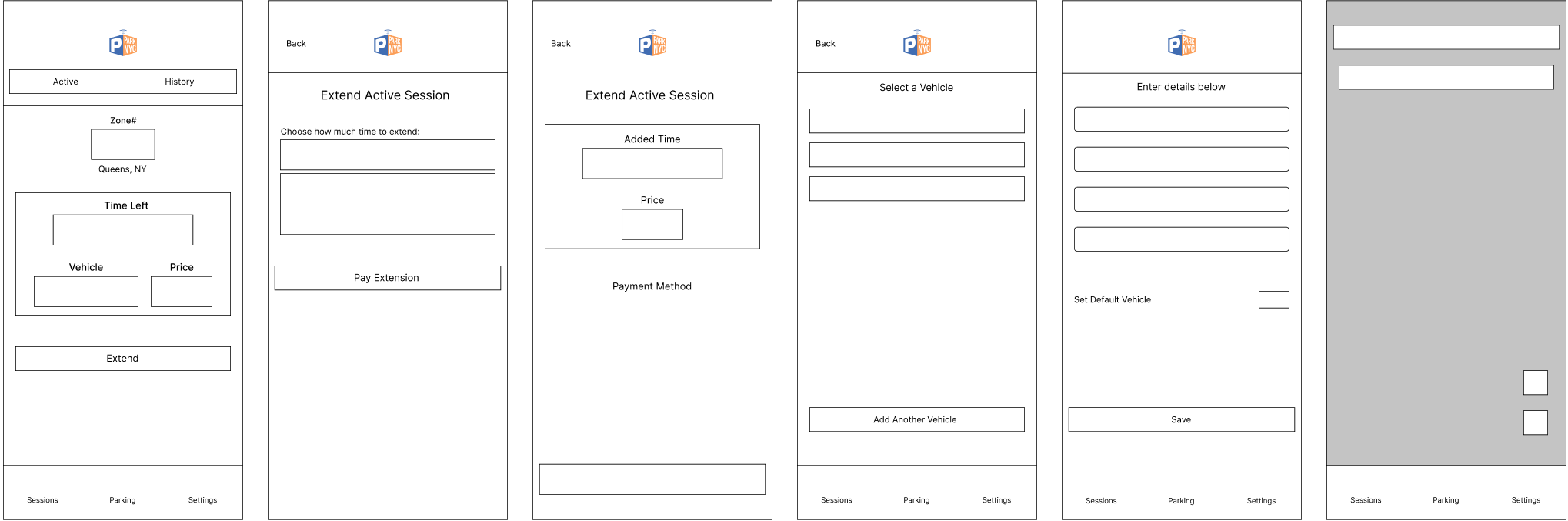
Potential Solution: A lot of changes must be made to improve the overall UX of this screen. We must eliminate the “find my car” page, which I think is unnecessary. The edit buttons are very light and must be replaced with a more expressive button. The main details: time, vehicle, and zone number need to be placed in the middle with less words surrounding each action. The map screen also needs to be updated because it has an outdated user interface. Lastly, I want to implement a method in which it alerts you whether the meter is active or not.
IDEATE
User Flows:
Based on the research, user persona, and user journey; I decided to focus on 3 main issues faced by users.

Information Architecture:
When creating information architecture, I implemented all content required helping me organize the hierarchy of each screen.
Lo-Fi Wireframe:
PROTOTYPE
Prototype and Validate:
Design Solution: Redesign landing page and make the account creation process easier to navigate by implementing phone number verification.
Pain Point 1: Difficulties signing in or creating account.
LANDING PAGE
BEFORE
AFTER
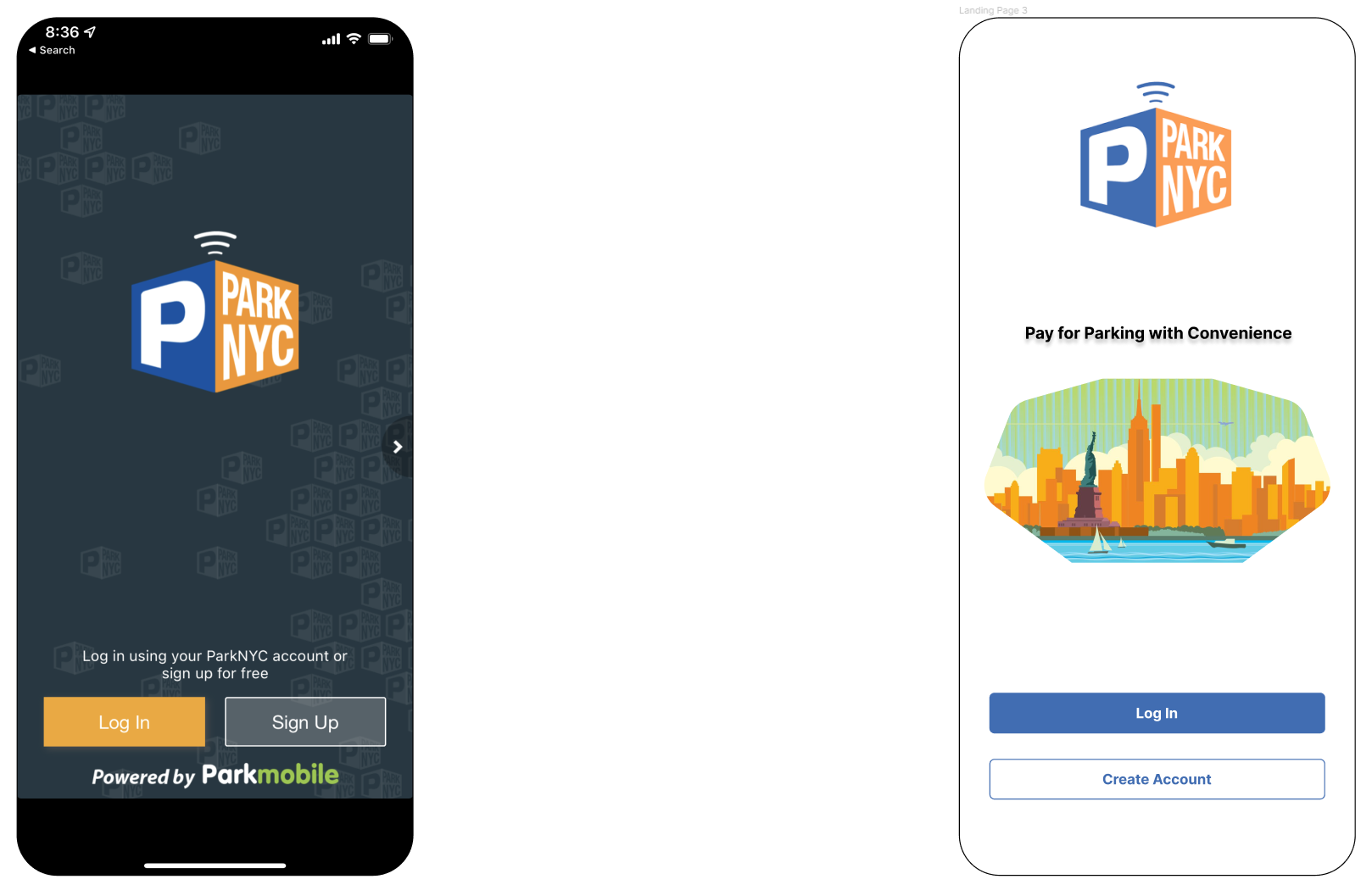
Outdated Landing Page
with tendencies to crash especially during account creation.
Changed background to white consistent with the rest of the app.

LOGIN PAGE
Login too far from login
information + don’t really need cancel button. Forgot Password should be closer to password input.
Main functions centered
without unnecessary words.

REGISTER PAGE
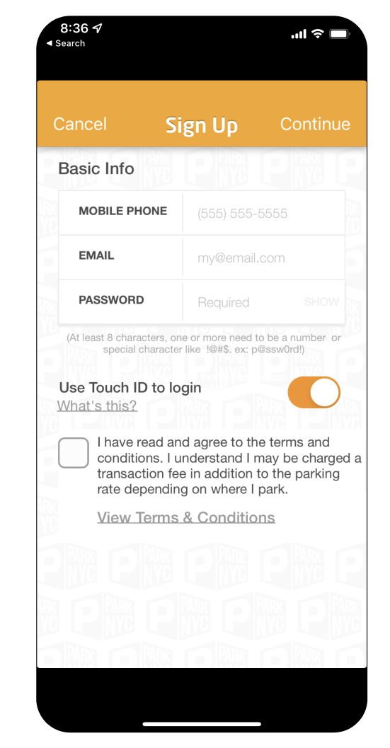
Initially, Email and Password are not essential for verification. Users need to create their accounts fast and easy. Therefore, email and password should be created after identity verification.
Each screen represents 3 basic steps to create an account. By making a users phone number the primary verification method, it helps prevent issues regarding forgotten emails and passwords.
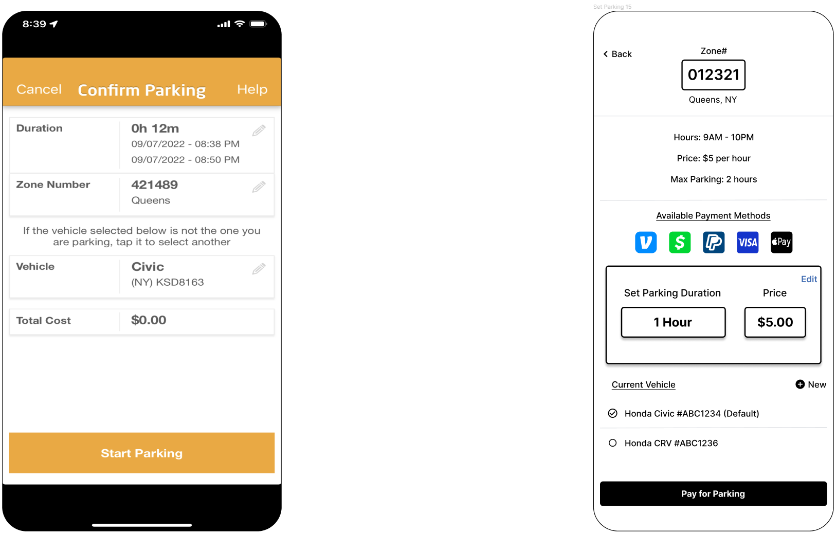
Design Solution: Eliminate current form of payment and add multiple payment methods.
Pain Point 2: Payment method lacks security and is inefficient.
PAYMENT PAGE

BEFORE
AFTER
Users are now able
to use multiple forms
of payment tailored
to their preferences.
This also speeds up
the process of payment
ultimately improving
user experience.
Users do not want to spend more than they have to. At the
same time, this method of payment is very inefficient
causing various processing failures with users.
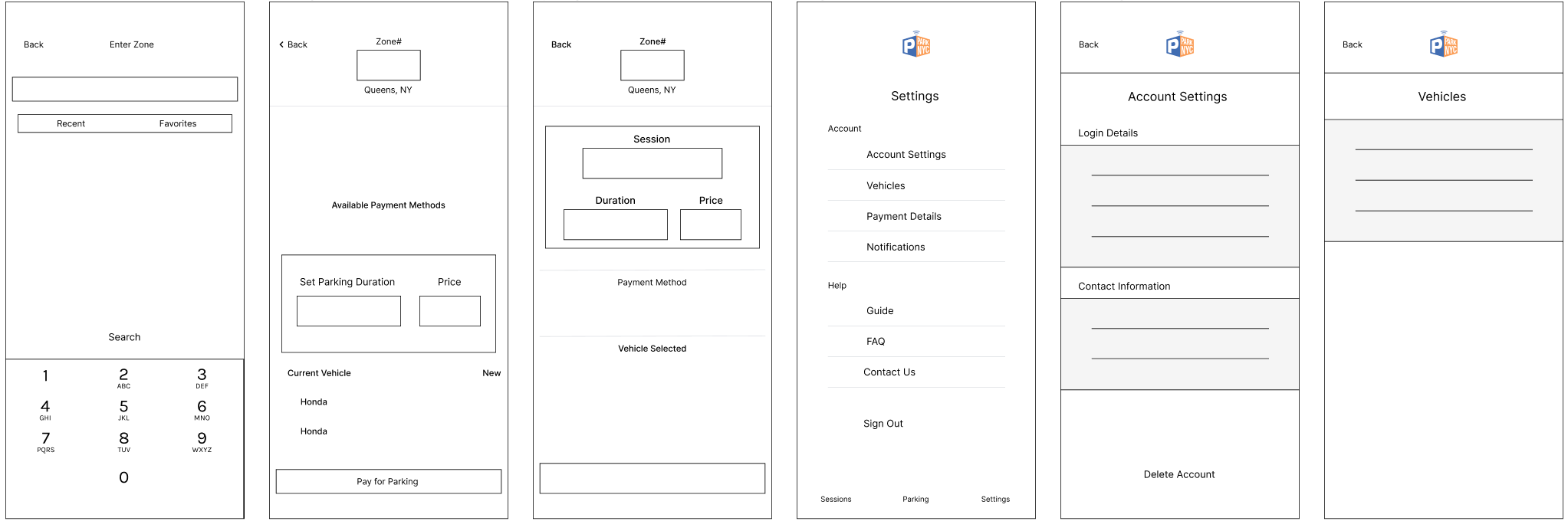
Design Solution: Implement useful information regarding parking rules. Emphasize important words and buttons so that users have a better experience managing parking sessions. Reorganize parking interface by eliminating “Find my car” and incorporate the new payment methods.
Pain Point 3: Confusing UX managing Parking Sessions.
MANAGE PARKING
PAGE
BEFORE
AFTER
These details in regards to zone # is very important for users in a rush. Users can now view this information
when selecting zone #
which eliminates having to leave the car to search for signs. The most important
part should be easy to spot which is parking duration and price.
Users are having issues navigating parking sessions.
This image of the parking session, lacks information
necessary for the user to complete transaction.
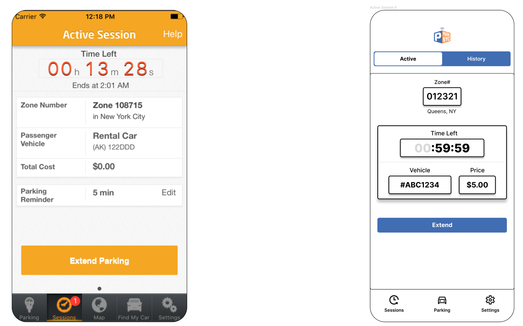
ACTIVE SESSION
PAGE
By centering all
relevant information, it
allows users to navigate
to specific functions
quicker. Users are always in a hurry and therefore parking details should be emphasized.
The fonts in this screen is not
consistent and needs reorganizing.
View Full Prototype:
TEST
Usability Testing:
After creating the full interactive prototype, I decided to survey the same 10 people who participated initially. Since this is a case study, and therefore I could not present the full functional app; instead I used the full working prototype. Here are the results:
From the 6/10 that encountered freezing - 6/10 believes they will still encounter freezing
From the 6/10 that encountered difficulties with account creation - 8/10 believes the new verification method looks more efficient.
From the 7/10 that have issues navigating the app - 8/10 believes they wont have any more issues navigating or finishing a task.
From the 10/10 users that have issues with payment method - 10/10 believes the new payment methods will be beneficial.
In conclusion, most of the users that had issues with the main ParkNYC app believes that they will have less issues with my redesigned version. Overall, I am content with my outcomes because UX and UI interfaces are always developing. The fact that at least one person finds my redesign more efficient than the original application through prototype encourages me to continue striving to become a better UX designer.