DOORMAN
Case Study: Web App Design - Solving recurring problems at work
Role: UX Designer, UI Designer
Date: June 2022 - September 2022
Tools: Figma, Microsoft Office, Google Drive
Project Overview:
Doormen are a huge part of luxury buildings all over the tri state area. We provide 24/7 security and support for shareholders on an everyday basis. In addition, doormen must maintain a covid safe environment, as well as enhanced safety measures during these unpredictable times. With this said, it gives doorman's very little room for error.
Problem:
Buildings with a higher population of shareholders or buildings with a short staff are examples of how miscommunication can be an issue. The most important responsibility as a doorman is security, therefore communication must be precise at all times. The majority of the shareholders are older and meticulous, causing a lot of time to be spent notifying shareholders with repetitive information.
Solution:
As a doorman of a building with short staff, I come across very similar issues with miscommunication. I figured the best way to negate this, is by creating a very straightforward web app that allows shareholders to stay in track of everything related to the building. This guarantees doormen to have increased focus on security, covid maintenance, and lobby assistance.
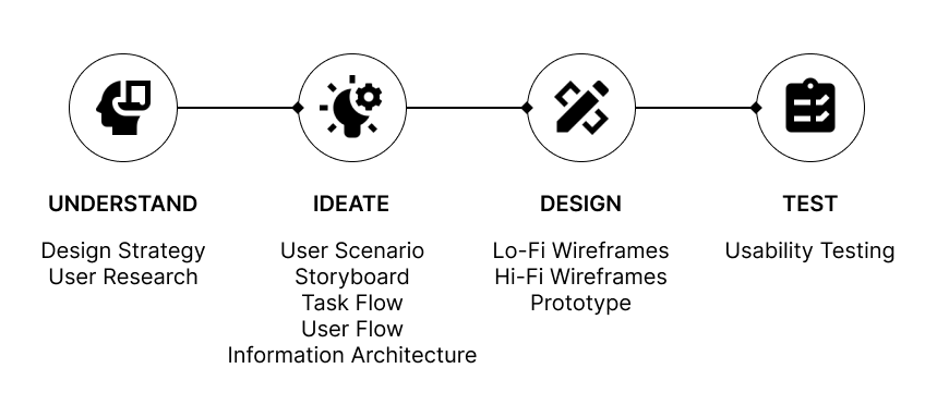
Design Process:
UNDERSTAND
Design Strategy:
Business Goals: Create online platform for improving communication with shareholders and tenants in luxury buildings or condominiums.
General Tasks: Keep track of building announcements, your incoming/outgoing deliveries, laundry and gym usage with automatic updates. Allow for easy requests for shareholders with any issue or misunderstandings.
Target Users: Shareholders and tenants that reside in managed buildings that rely on doormans and porters for any assistance.
Technology Constraints: Slow internet connection, mobile app/ smartphones, and outdated devices.
Success Factors: Ability to monitor building maintenance away from home, better time management, customization of alerts, and improved communication regarding certain issues.
User Research:
Using qualitative methods, I brainstormed potential questions to better understand the end user. Using these questions, I interviewed 3 housekeepers, 5 shareholders, and 3 staff including myself; whom all have firsthand experience with miscommunication. These are some questions I asked them:
How can a website that keeps track of announcements, packages, laundry + gym availability be useful in your everyday life?
Shareholders emphasized better time management and also convenient when they are not around.
Housekeepers explained how helpful it is for those that do laundry everyday as some days are busier than others, therefore being able to keep track will help minimize issues.
Even though staff is not the main target audience, I thought it was important to provide input from a different perspective. Staff loved the idea of delivery logs because it provides as proof when misplacements occur.
What are some problems in the building you come across that can easily be fixed?
Misplaced or undelivered packages
Unpredictable gym scheduling because of capacity
Not receiving important notices or forgetting
Unattended laundry machines
Lack of urgency with tasks
What type of data would be significant?
Building announcements
Contact information
Package log
Reporting issues
Amenity availability
IDEATE
User Scenario:
This is a scenario based on personal experience, highlighting a negative outcome from miscommunication.
Abe is a doorman working an early Monday morning shift and has many responsibilities to fulfill throughout the day. Between 7am – 930 am, Abe must focus on ensuring there’s taxis ready for shareholders taking their kids to school. Now this might sound fairly easy, but this is just one task that is being dealt with. During this time span, Abe has to attend to any Doctor, housekeeper, general contractors, and other guests who may need assistance in entering an apartment.
At around 8am is prime time for Abe. Everybody is in a rush to get to their destination, which gives Abe very little margin of error. At the moment, Abe is busy trying to find a cab for a shareholder late to work. It’s taking longer than expected, due to the crowded Park Ave traffic and additional doorman's requesting taxis for their building. While this shareholder is understanding, there is another shareholder who is not happy due to the unanswered phone calls about current gym capacity. The shareholder calls, then complains to the manager that Abe is not aware of what’s happening in the lobby. Even though Abe heard the phone call, it’s very rude to just leave the shareholder without a cab for work.
Abe becomes frustrated due to his lack of appreciation and develops DoormanDuty hoping to solve and further prevent issues dealing with miscommunication. Now that we can include DoormanDuty into the picture, Abe can solely focus on urgent tasks in the lobby. By incorporating the web app, this upset shareholder can now view the gym capacity at their own convenience. With this said, they can appropriately schedule with personal trainers not having to deal with unanswered phone calls. This shareholder is also very picky with what machines he uses. The gym machine tracker allows the shareholder to view availability instead of waiting in the gym until someone is done. Overall, shareholders find the app useful with scheduling and building organization. Abe can now limit miscommunication with the shareholders and improve his attention for lobby security and demanding requests.
Storyboard:

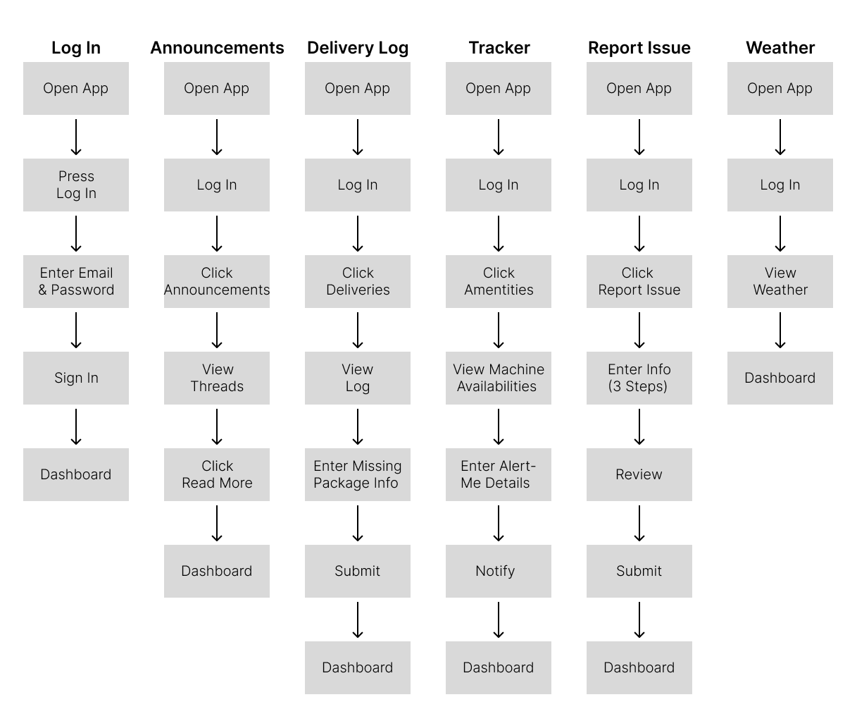
Task Flow:

User Flow:
Using the task flows, I created user flows defining user journey.
Green Arrows = Positive
Red Arrows = Negative
Black Arrows = Next
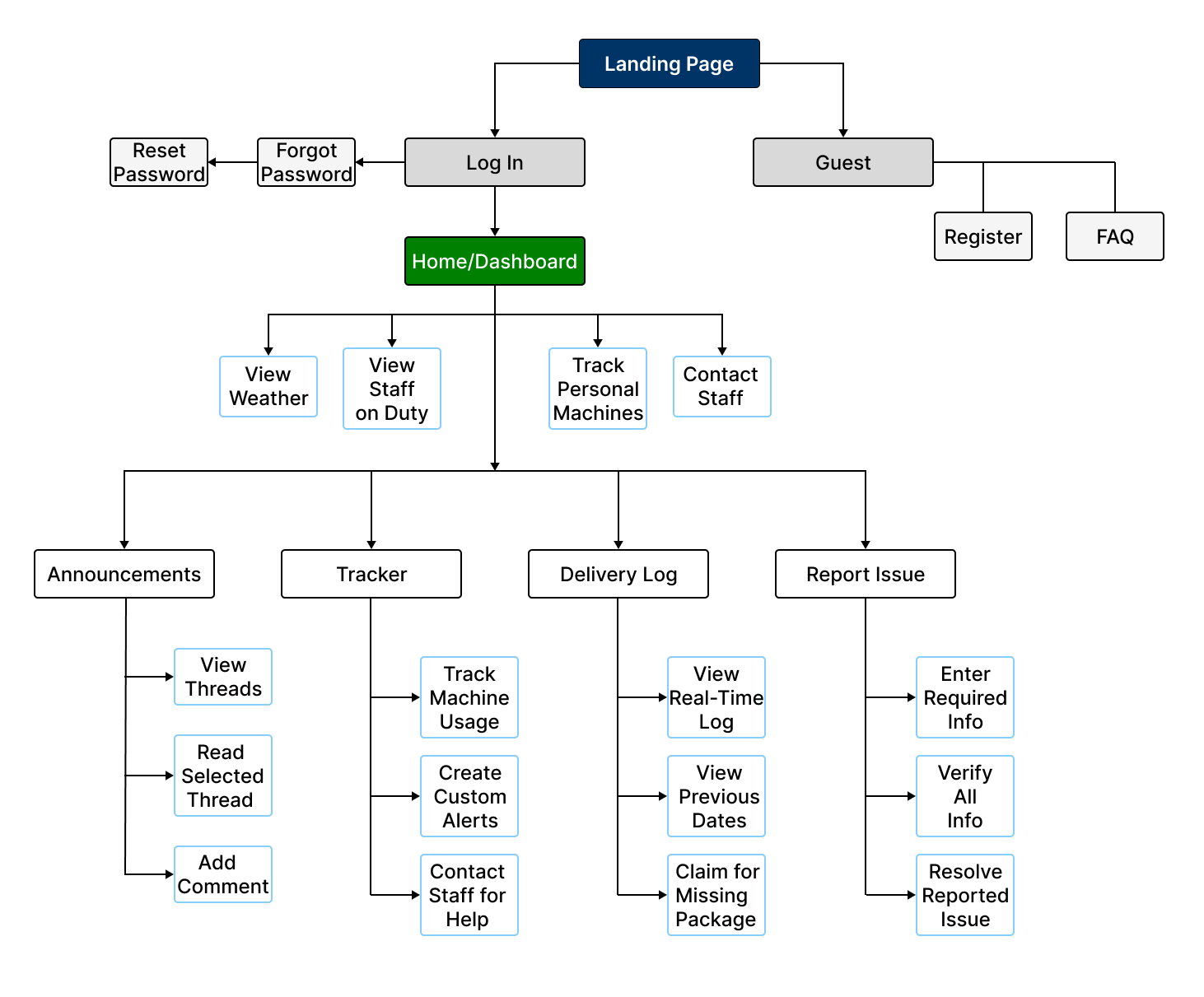
Information Architecture:
Using task and user flows, I constructed information architecture which will help when sketching and wireframing the design layouts.
DESIGN
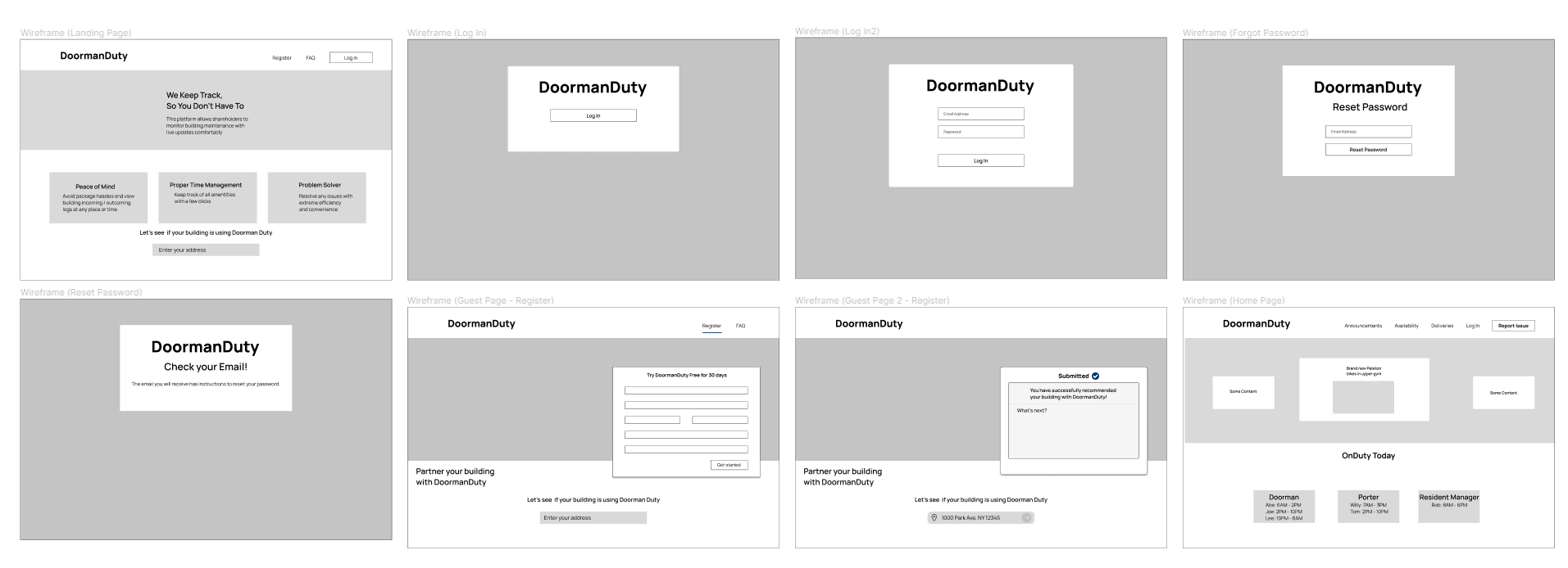
Low-Fidelity Wireframes:
Using Figma, I created Lo-Fi wireframes using a 14-inch MacBook for a base frame. My thought process when designing was very simple and straight to the point. Tenants and shareholders need their information right in front of them. With this said, I tried not to put any words that aren’t necessary and instead focused on the main task per web page.
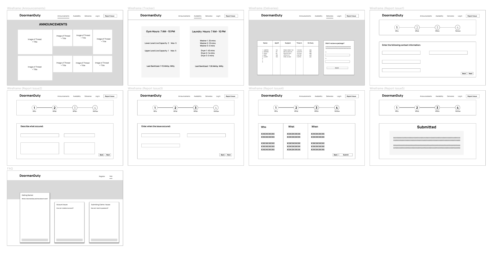
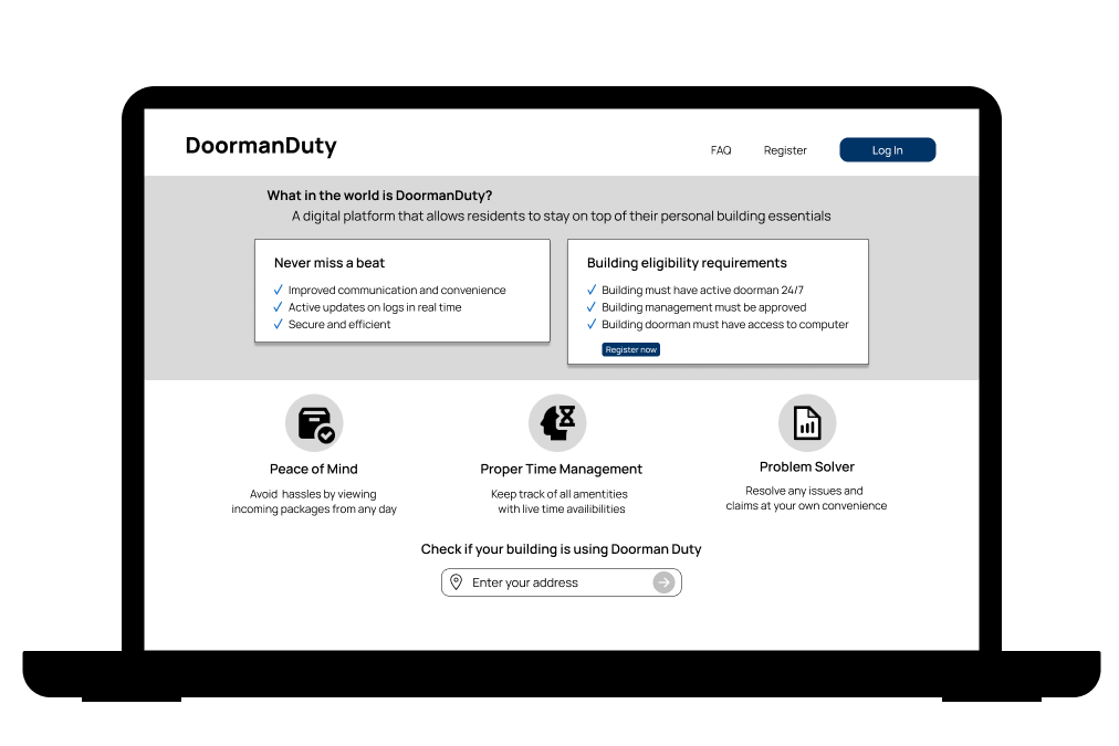
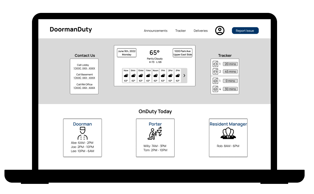
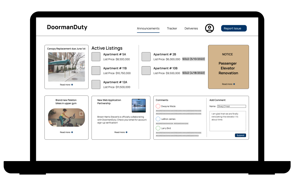
High-Fidelity Wireframes:
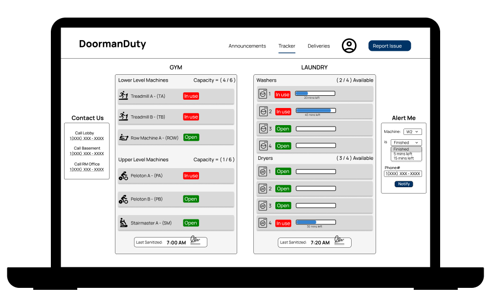
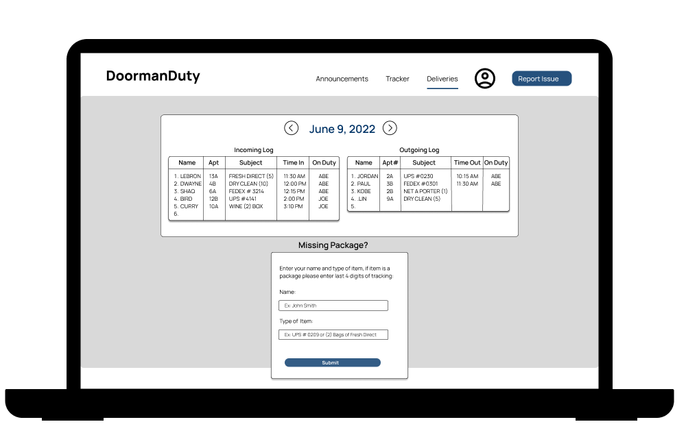
Using feedback and iterations, I created the high-fidelity wireframes. I looked over the low fidelity frames repeatedly and made some changes. These pages mainly consist of boxes of information, which I thought would help users identify what they are looking for. The main difference from the low fidelity wireframes are the three main task pages: announcements, tracker, and deliveries. I incorporated interactive buttons that will help the user navigate around each page.

Prototype:
TEST
Usability Testing:
Using my hi-fidelity website, I used a prototype and showed multiple shareholders and staff. I asked the shareholders to navigate through the web app and click on tasks that they might use themselves. Some observations include:
“Very informative.”
“Interesting concept, the tracker looks like it will help us decide when to do laundry or go to the gym.”
“I think you should add more widgets for the homepage.“
“Announcements page will be beneficial for me since I’m barely in town.“
“This looks amazing. The first thing I noticed was the weather which is always what I need when deciding my plans for the day. Are we able to personalize the weather app?”
In conclusion, this entire project that I started from scratch started as an idea. With everything said and done, this can be an idea that formulates to something bigger. It has plenty of uses for doormen across the tri-state area, in which I believe can be very instrumental towards running day to day operations.